A calmer order flow that lifted conversion by 3.25%

The context
Within the Digital Sales team I was responsible for kpn.com, KPN’s main digital touchpoint, optimising the sales flows for Internet & TV, Mobile and Accessories.
The challenge
Next to UX and CRO improvements on the existing order flows, I led the design process for a completely new, user-centred concept for ordering residential and mobile subscriptions.
How I approached it
Validating assumptions, spotting the pain points
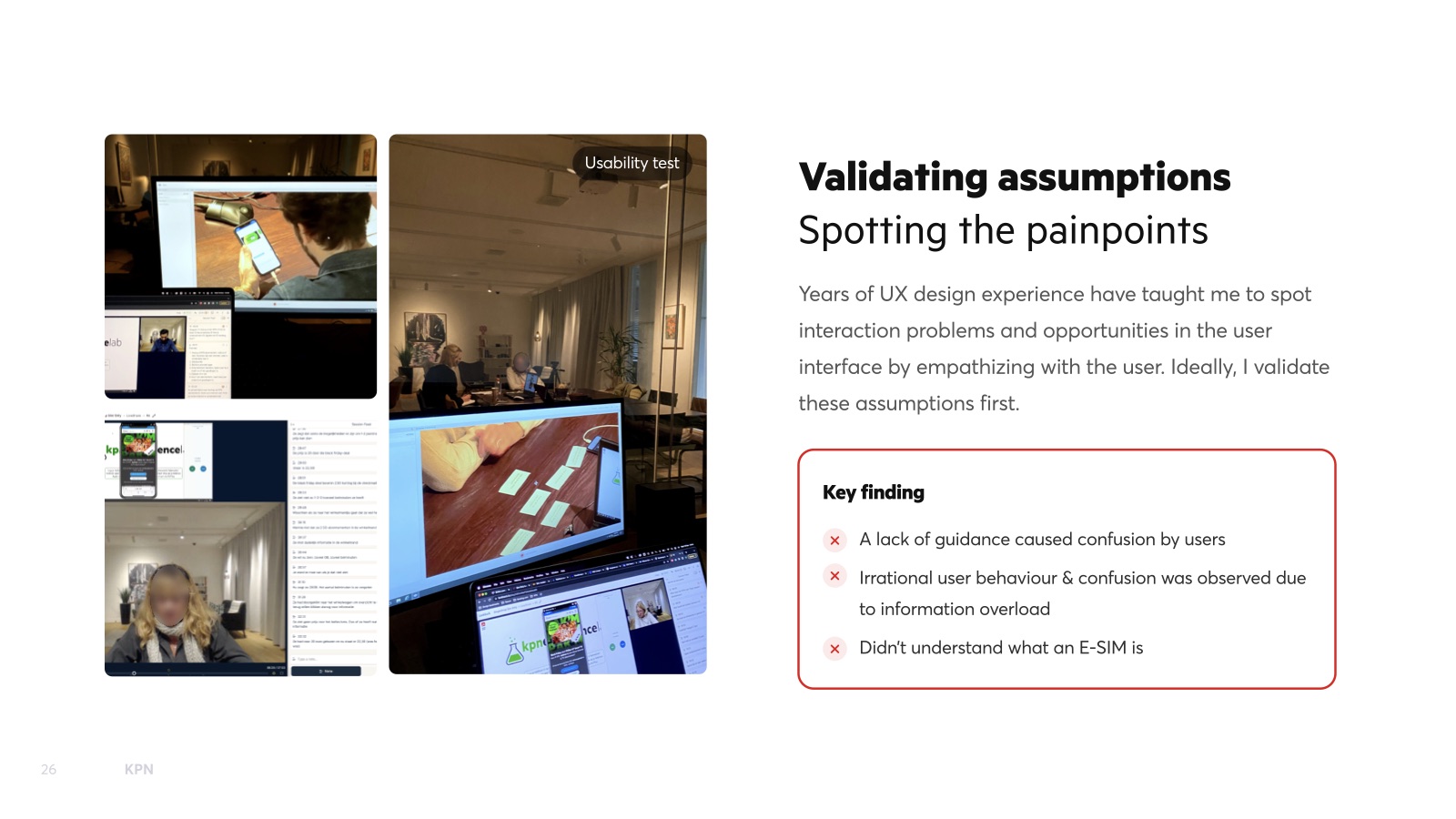
Years of UX work taught me to spot interaction problems quickly, but I validate them first. Usability tests showed that a lack of guidance confused users, information overload caused irrational behaviour, and many didn’t understand what an e-SIM is.
A mobile-first concept for the core structure
I re-ordered the steps to make them more logical and focused the flow on why you should choose KPN over competitors, because we couldn’t compete on price alone.
Persuasive, problem-solving design
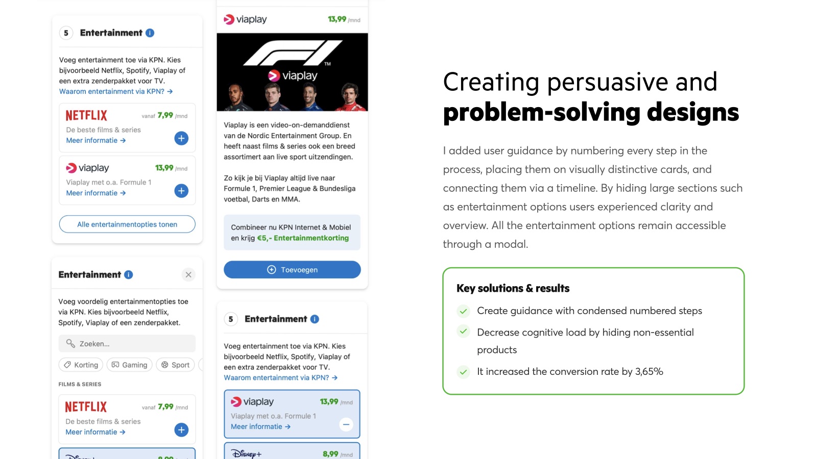
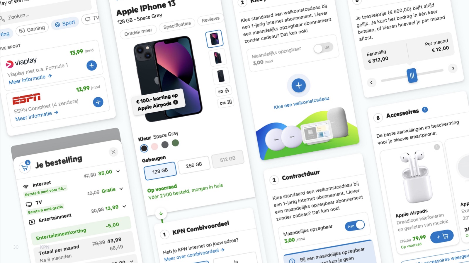
I added guidance by numbering every step, placing each on a distinct card and connecting them with a timeline. Hiding large sections like entertainment options behind a modal gave users clarity without taking anything away.
Accessible and documented
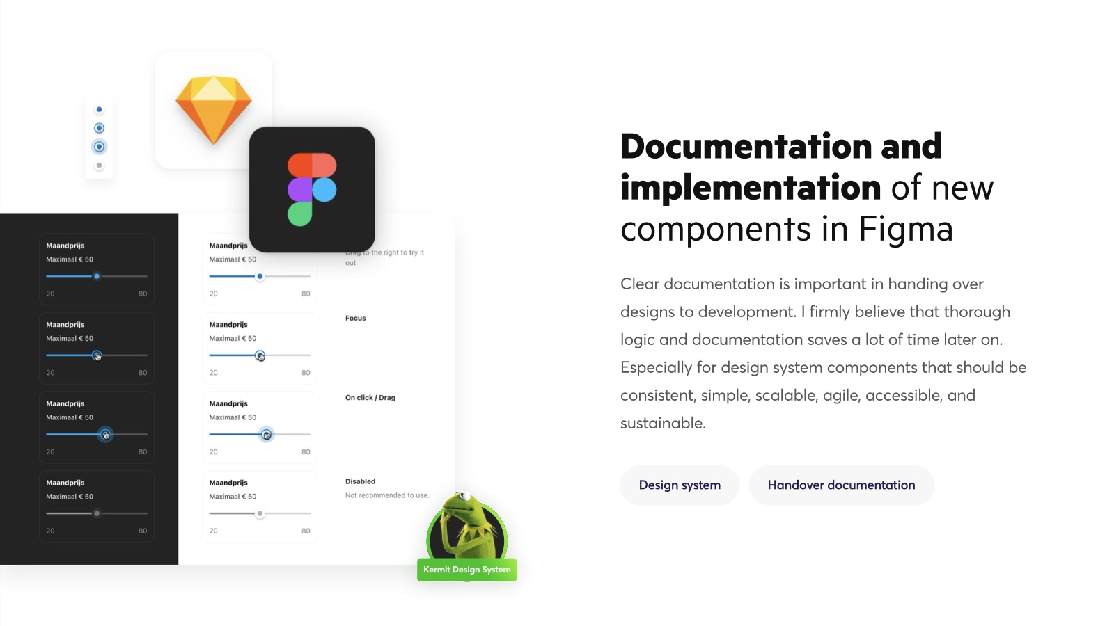
For the final delivery I invited someone with a vision impairment to navigate the new page with a screen reader (WCAG 2.2). New components were documented in the Kermit design system, because thorough logic and documentation save a lot of time later.
It all came down to less information, at the right moment.