From a 2007 portal to self-service for every business customer
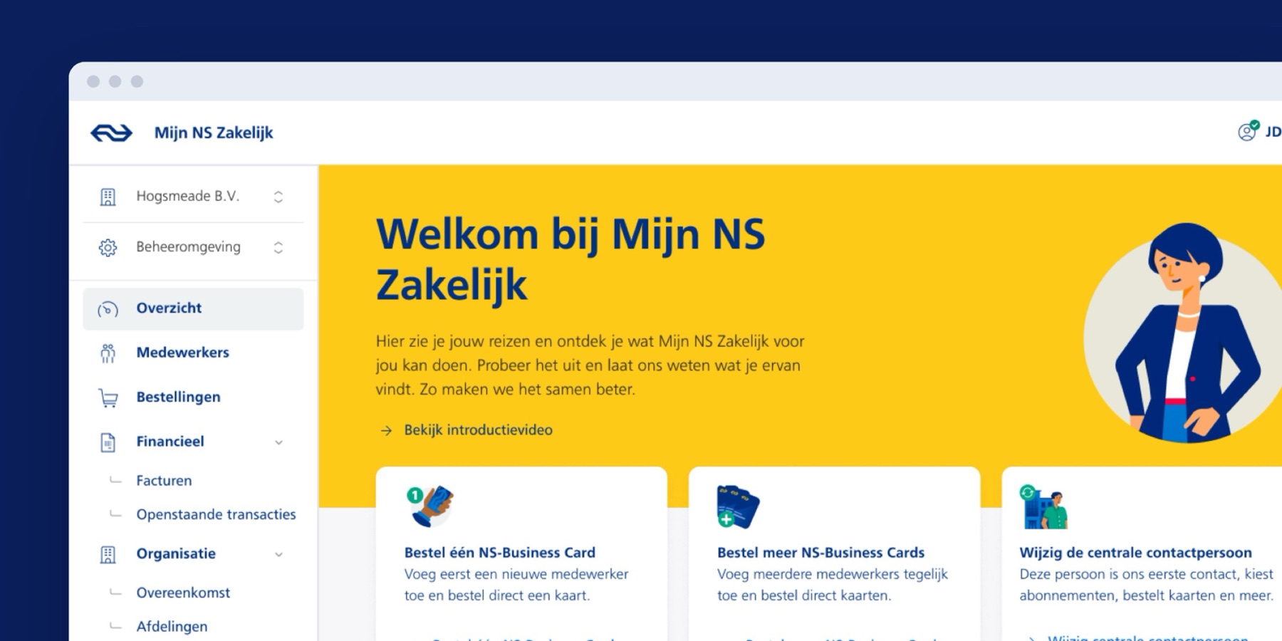
The context
Every NS-Business Card in the Netherlands was about to move from the OV-chipkaart to the new OV-pas. The portal that had to carry them across went live in 2007, the same year as the first iPhone.
Mijn NS Zakelijk is where organisations, from freelancers to corporates with thousands of employees, order and manage those cards. Their travellers use it to see trips, subscriptions and refunds.
The challenge
Under a 2020 facelift sat an end-of-life Java platform without analytics. We couldn’t see where people got stuck; only customer service could tell us. And they did: 45% of questions about customer details were “How do I change my address?”
Anyone with two roles needed two logins, the top reason customers called. And the OV-pas date was fixed. The scope could move. The deadline couldn’t.
How it unfolded
Drag, swipe or use the arrow keysUse the left and right arrow keys to move between events.
2007
The portal goes live
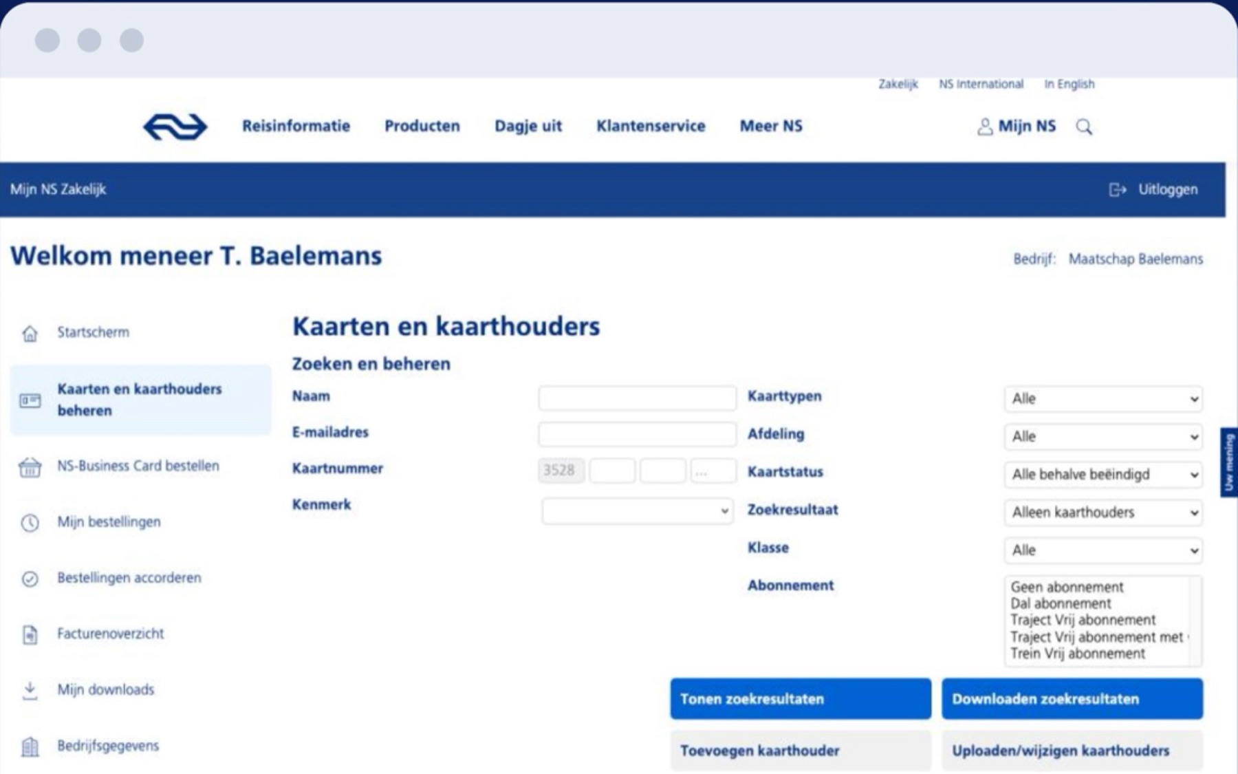 Same year as the first iPhone
2020
A fresh coat of paint
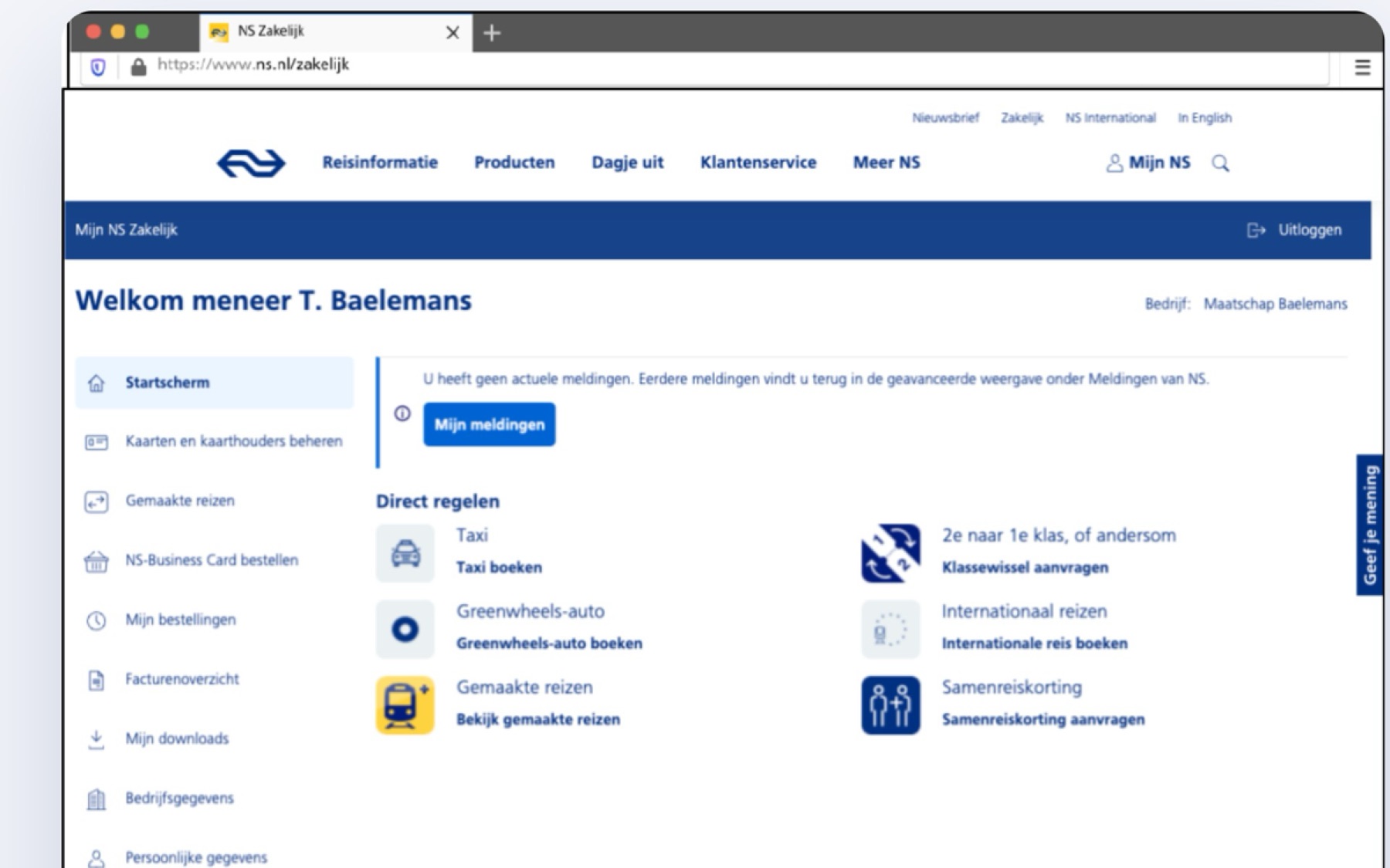 Same end-of-life Java underneath
2021
Nessie proof of concept
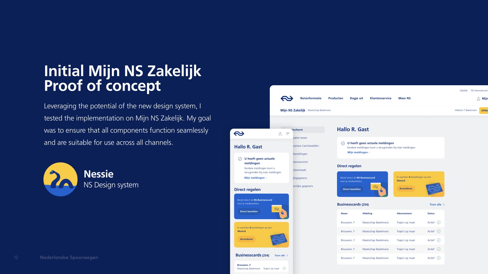 My first test of the new design system here
Discovery
40+ conversations
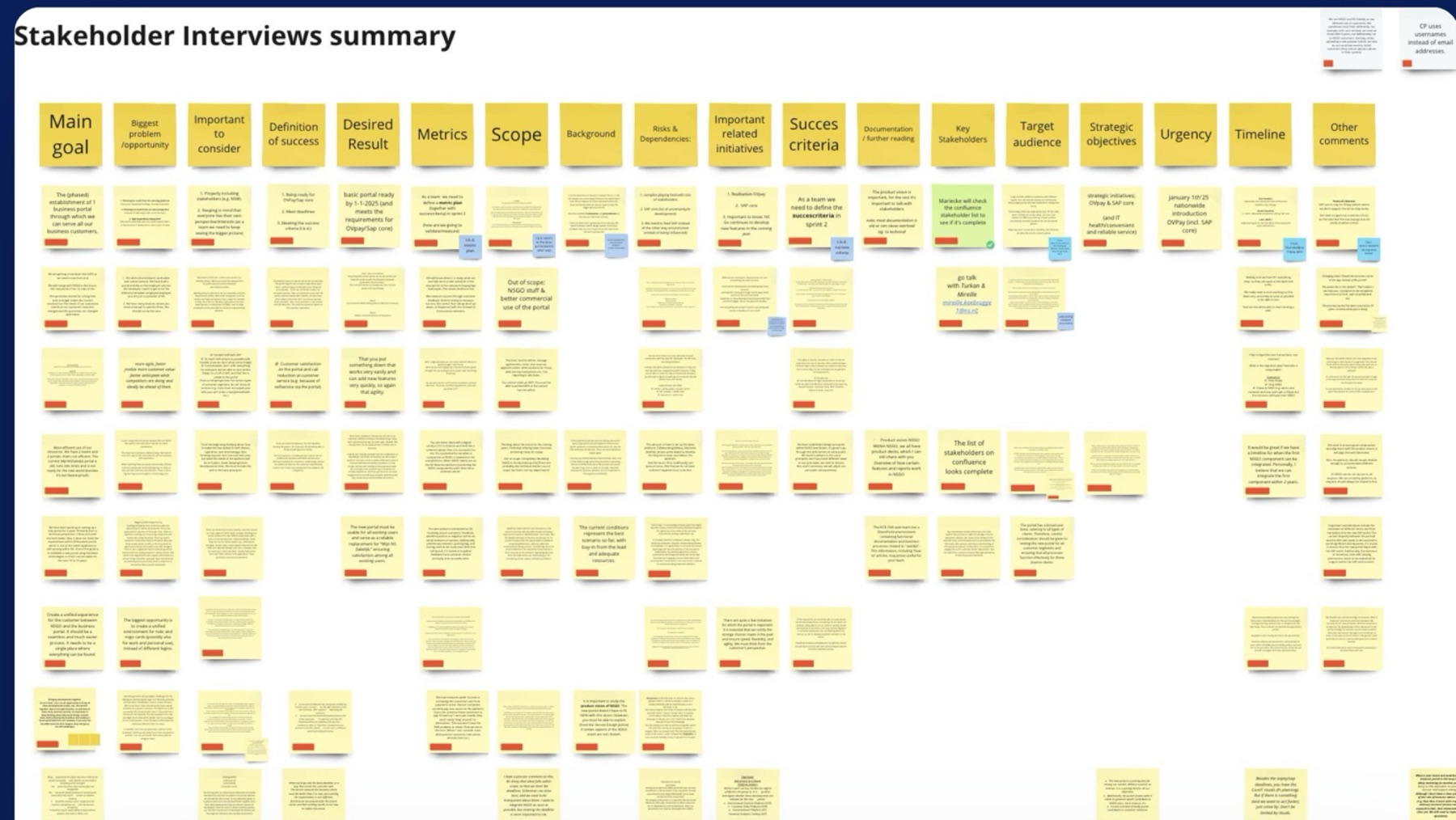 Customer service first, then every company size
Scoping
185 top tasks, one MVP
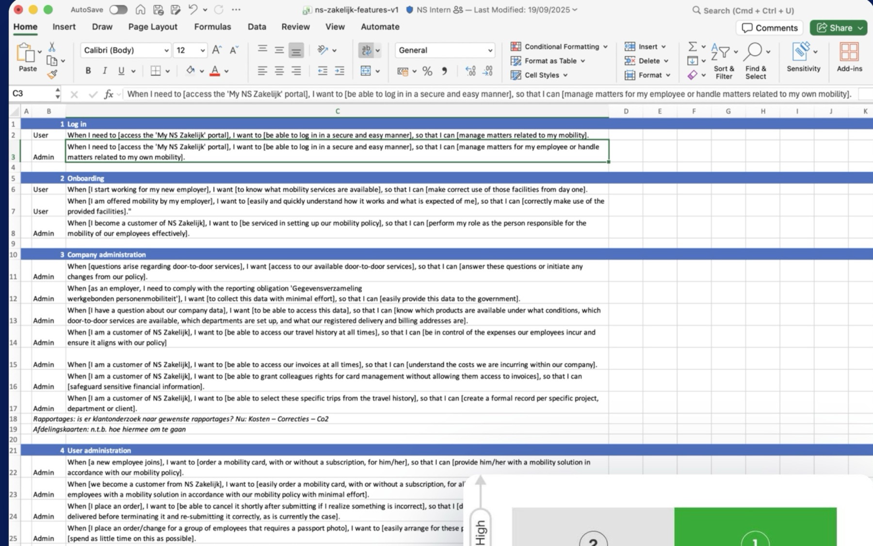 140 made the cut
Design
77 flows for 5 roles
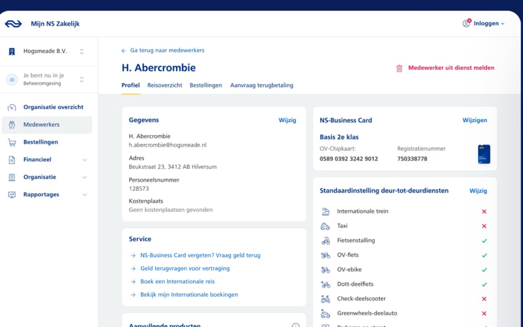 Map, prototype, test, document. Repeat.
Mobile
Five rounds with Claude
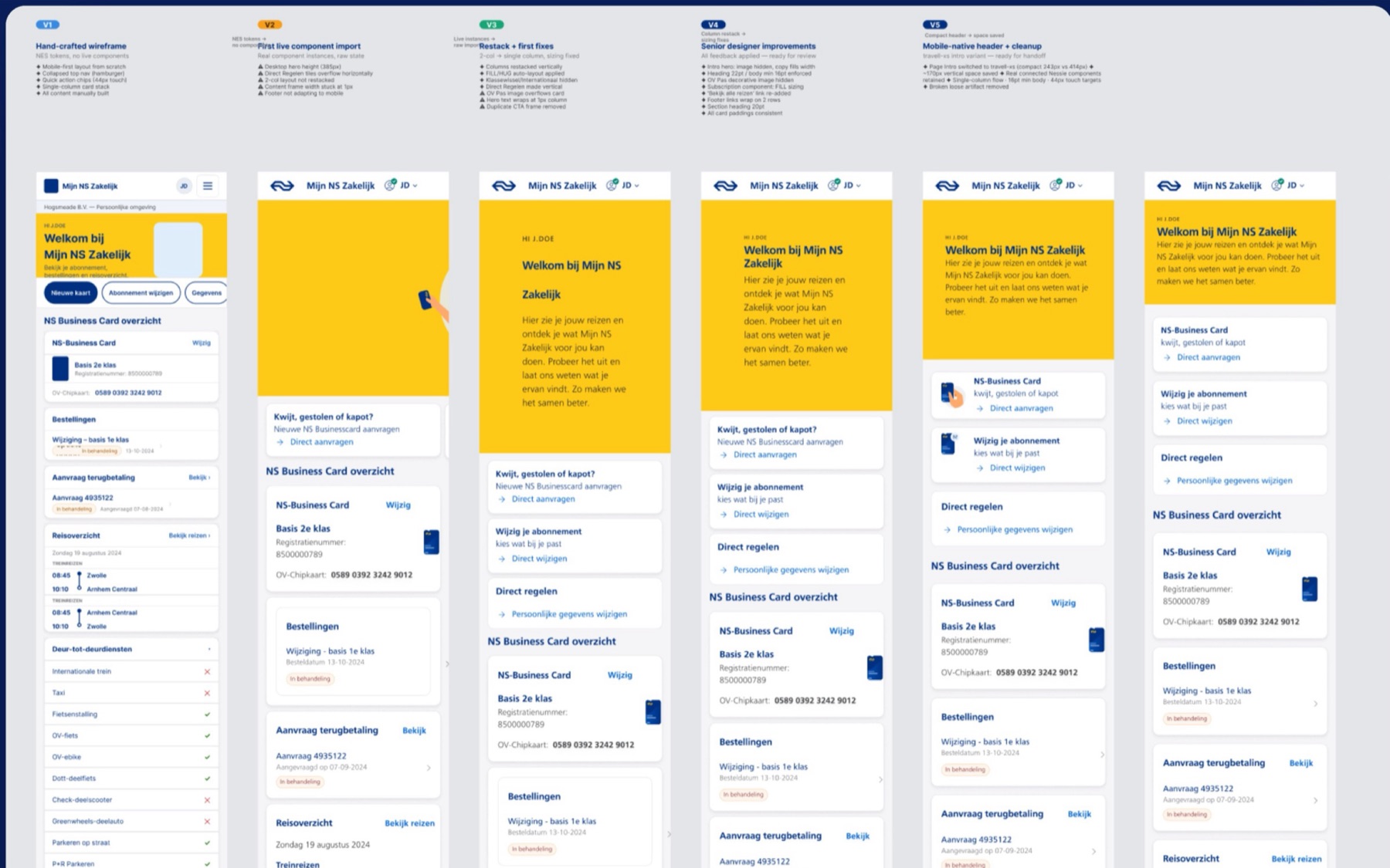 ~170 px saved before the first task
Pre-launch
Audited in production
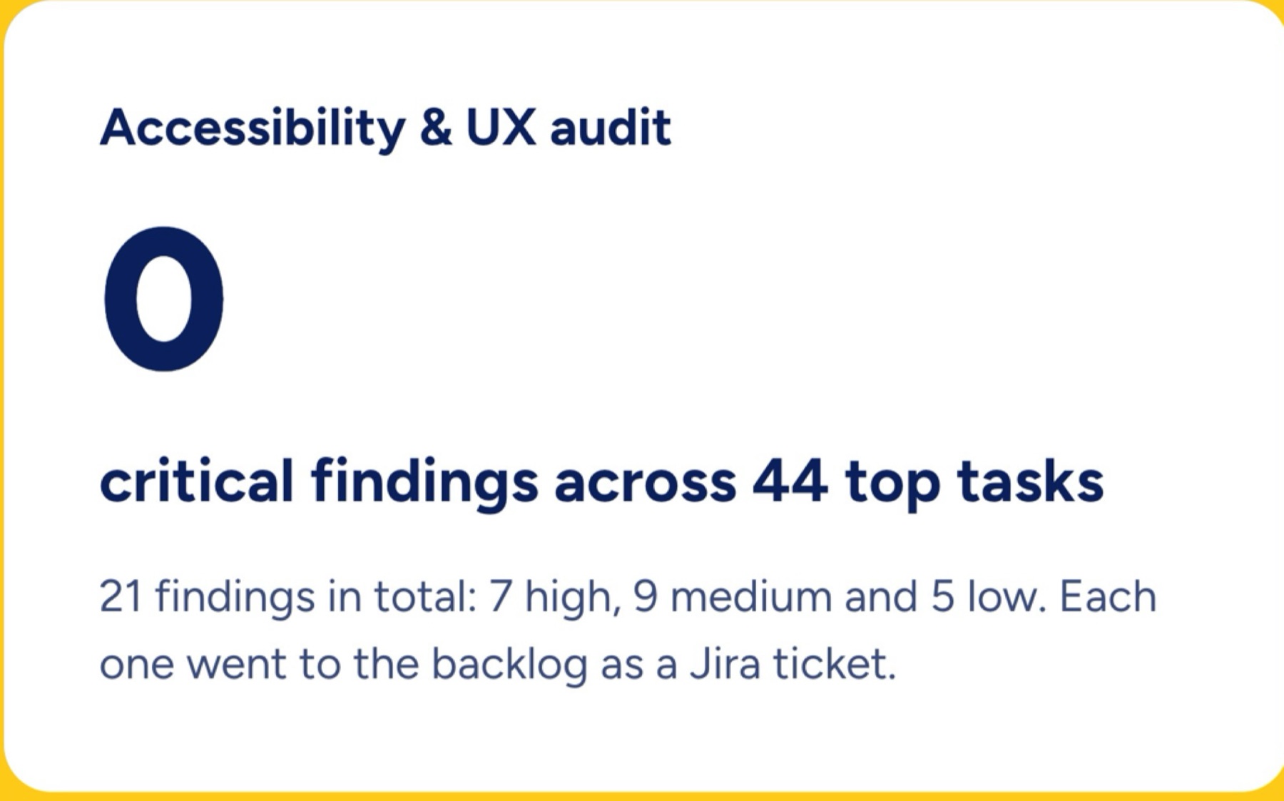 0 critical findings in 44 top tasks
Oct 2026
Live for the OV-pas
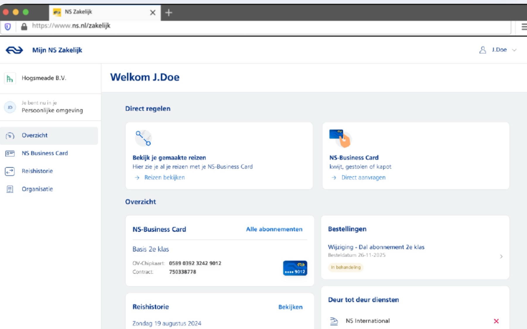 One login. Every business customer.
How I approached it
Four things we kept hearing
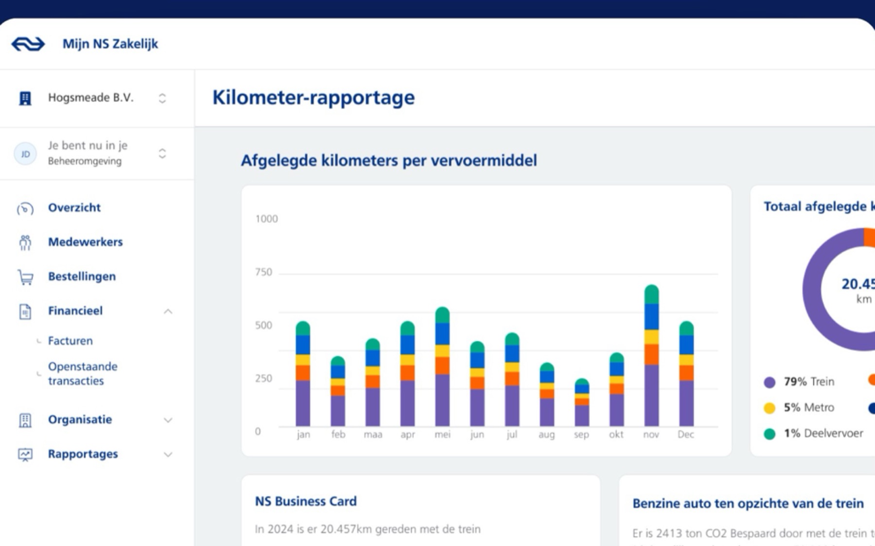
People trust what they can check, so order status shows wherever it matters. The next step is never obvious, so every flow ends by saying what happens next. Roles confuse more than they help, so each role got its own start page. And for employers it’s all about money, so we built the cost and CO₂ reports they asked for.
One login, every role
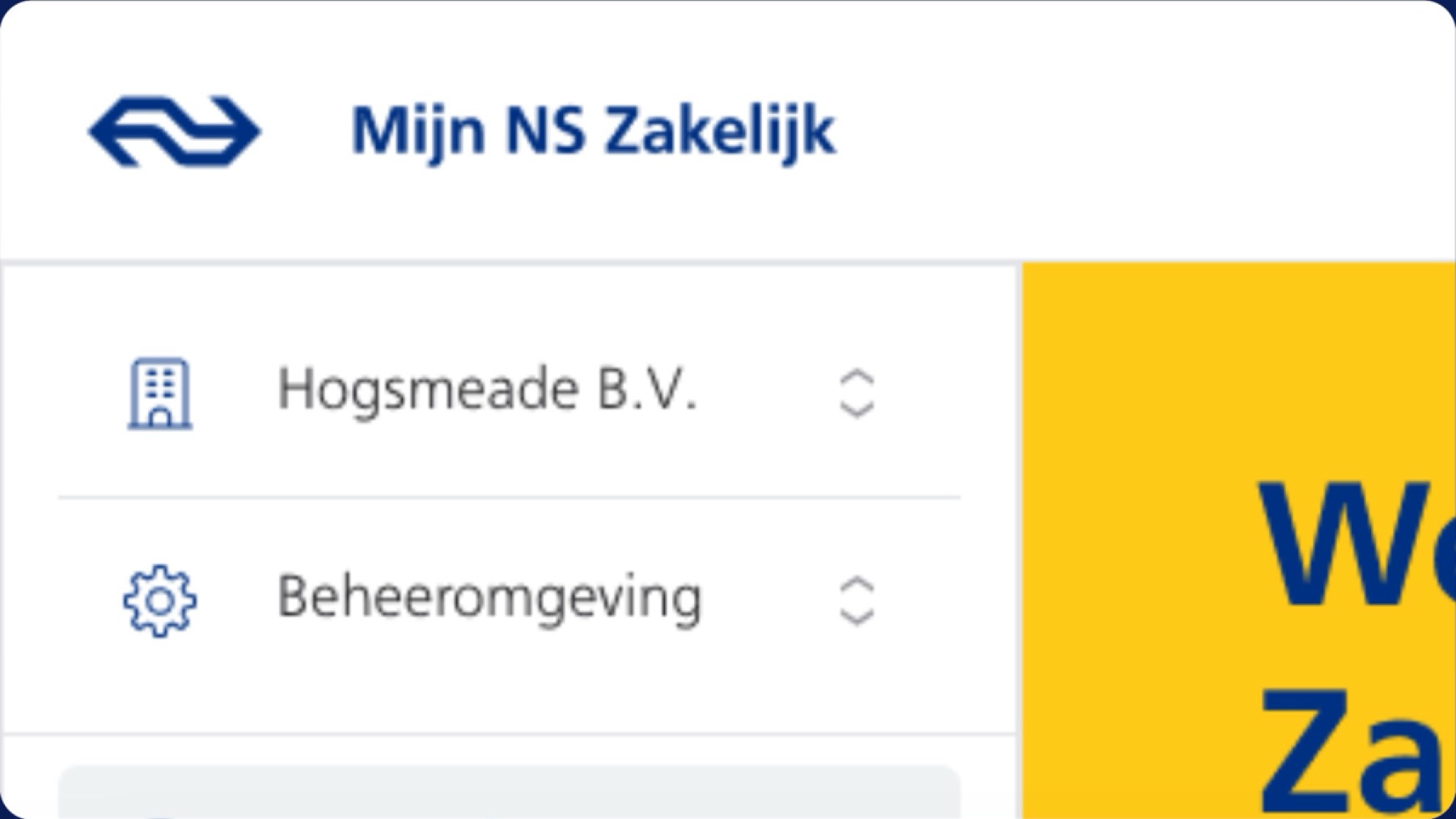
Many people are both cardholder and contact person; freelancers are often everything at once. Two accounts became one personal login with a role switcher in the sidebar. The price: with two-factor authentication, a department can no longer share an account. We accepted that for security, and said so on the login screen.
Tasks, not menus
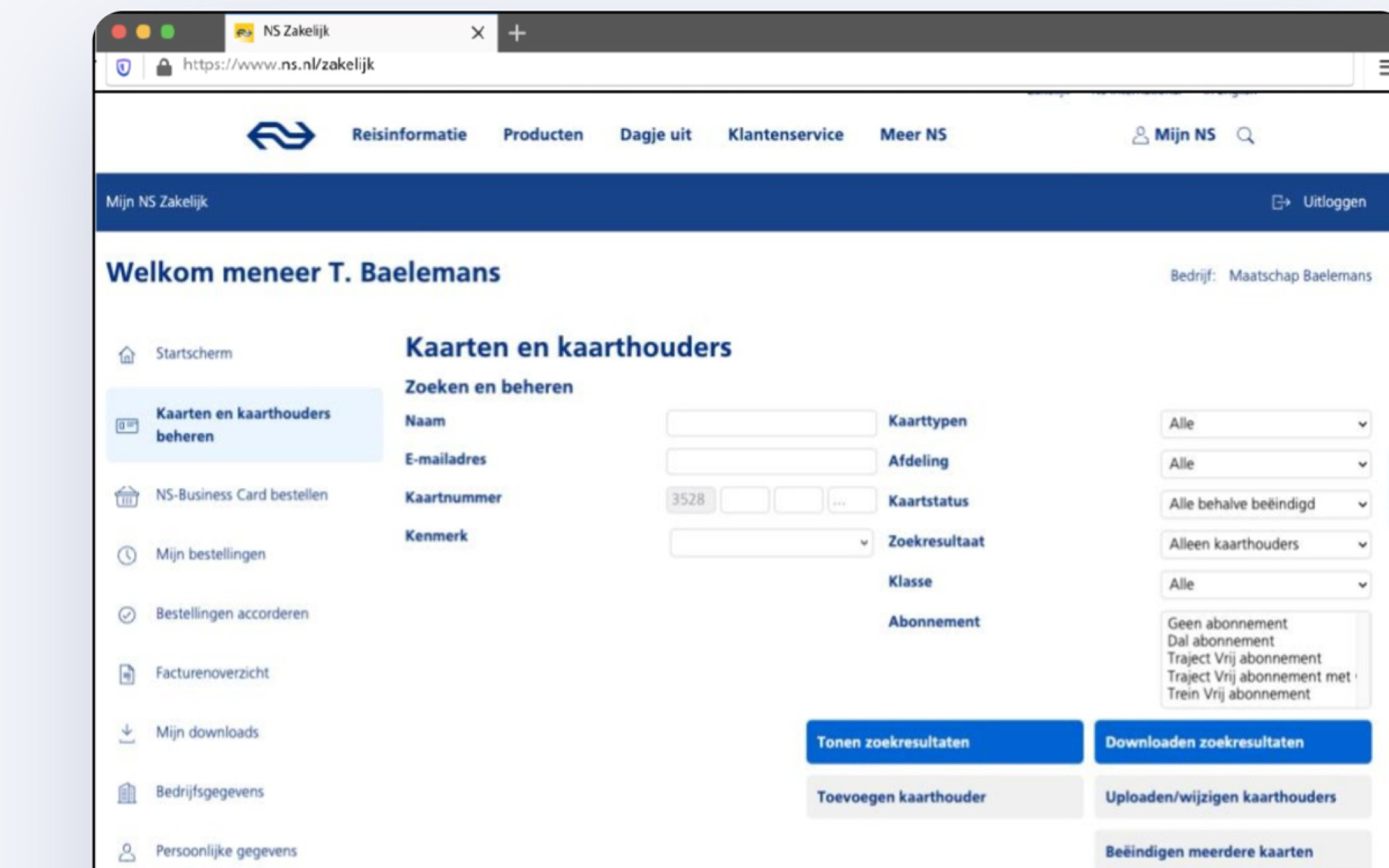
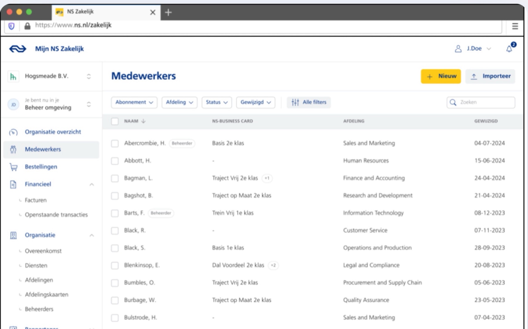
Key actions used to hide under “Manage cards and cardholders”, some five clicks deep. Now each role lands on its own start page, led by “Direct regelen”: top tasks as tiles, one click away. Admins start from their people, with every card, order and trip one click further.
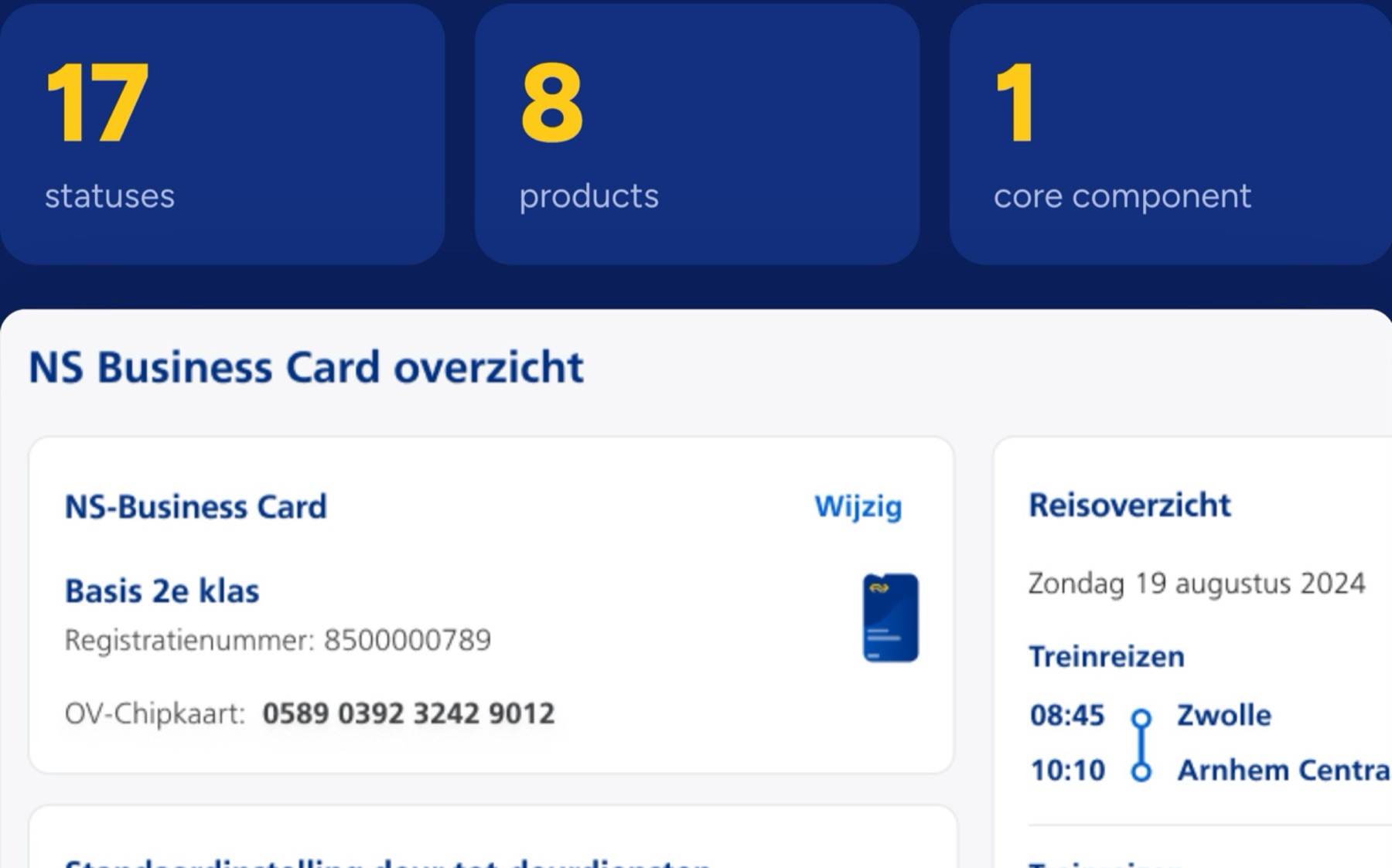
One widget, 17 statuses
What someone may do with a card depends on order status, contract dates, product and card status, spread over at least five systems. Without one mapping, an archived employee was still offered “Change”. With the SAP and card teams we drew a decision tree behind one core widget. Now there’s one place to fix a rule, and every screen follows.
Cutting scope, out loud
The date couldn’t move, so the scope did. Every cut went on a list with its cost written next to it: departments set up by NS on request, no undo after cancelling, two card types side by side until 2027. The one that hurt was search, filters and multiselect. They’re first on the roadmap after go-live.
Built for thousands of cards
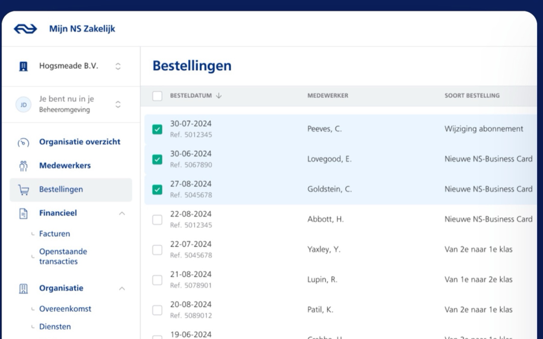
Large customers are 1% of accounts but hold 63% of all cards. The screens they use every week are designed for volume: approve orders in bulk, see one person in full, and report kilometres and CO₂ saved across the whole organisation.
The data was never missing. The mapping was.
Results
What I take with me
- 01
Good is sometimes good enough
A fixed date forces cuts. Name each one and its cost, and keep the v2 design ready, so a cut is a step, not a dead end.
- 02
In a complex chain, the mapping is the design
With SAP, identity and card systems behind every screen, the most valuable artefact was often a decision tree, not a screen.
- 03
AI speeds up the searching, not the judgement
Claude saved the most time on searching, analysing and sorting. Its output is only as good as the context you give it, and the final call stays with the designer.